A professional drone services company approached me to redesign their website after realizing the original version did not reflect their brand or service quality. The goal was simple: transform an unfinished looking site into a clean, conversion focused experience without changing platforms.
Challenges
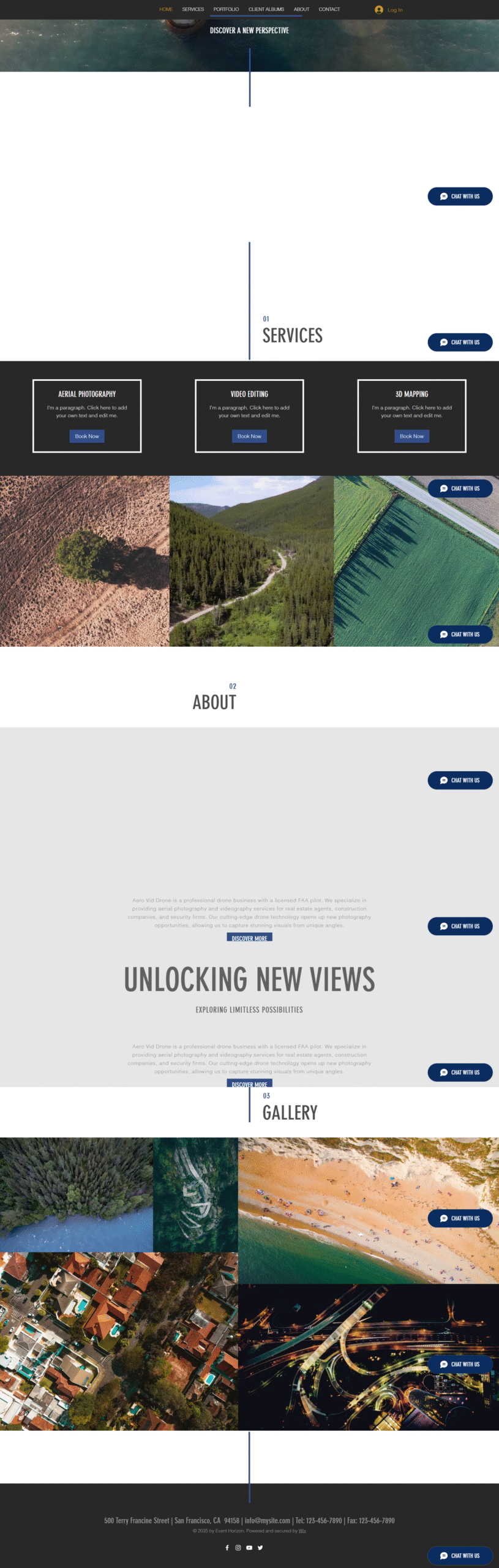
The original website was designed internally by the client but lacked cohesion. The colors did not match the brand identity, the layout felt incomplete, and the overall experience did not inspire trust. While the business offered high quality drone services, the website failed to communicate professionalism or credibility.
Another key challenge was platform limitation. The site was built on Wix, and the client had already paid for a subscription, making a move to WordPress impractical at the time.
The Problem
The main issue was not the platform but how it was used. The existing Wix site had weak visual hierarchy, inconsistent branding, and no clear conversion path. Visitors were not being guided toward services, inquiries, or checkout. The site looked more like a draft than a finished business website.
Rather than pushing for a platform change, I accepted the challenge to redesign within Wix and extract the best possible results.
Objectives
Align the website design with the brand identity and logo colors
Create a clean, professional layout that builds trust
Improve conversion through clear messaging and structure
Highlight individual drone services clearly
Make it easy for visitors to understand, choose, and purchase services
The Process
I approached the redesign with a conversion first mindset. Every design and content decision was made to support clarity, trust, and action. The focus was not on flashy visuals, but on guiding users smoothly from landing to inquiry or checkout.
Steps Taken:
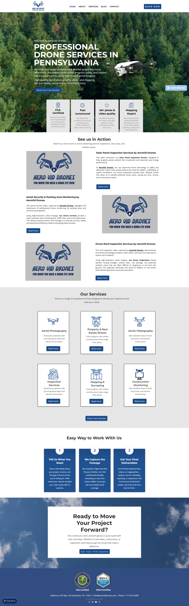
Rebuilt the visual structure to match the brand colors and logo
Simplified the layout for better readability and flow
Added a strong video hero section with a clear “Why Choose Us” message
Created individual service pages to clearly explain each offering
Integrated checkout options for services to reduce friction
Added an “Easy to Work With Us” section to explain the process and build confidence
Placed strong calls to action across all service pages
Results
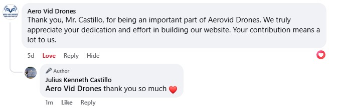
The final website is clean, professional, and fully aligned with the brand identity. While simple in design, it now clearly communicates value, guides users through services, and encourages action.
The redesigned site features:
Consistent branding and color usage
A high impact video hero section for immediate engagement
Conversion focused sections that answer key customer questions
Individual service pages with checkout capability
Clear calls to action throughout the site
The result is a website that looks finished, feels trustworthy, and works as a true business tool rather than just an online presence.