From Agency Build to High-Converting Construction Website (Real Client)
- Home
- Case Studies
- From Agency Build to High-Converting Construction Website (Real Client)
Project Details
- Client: Construction Company
- CaseType: Website Redesign
- Date : 2026
- Duration: 3 Weeks
Project Overview
Transforming an Agency-Built Website Into a Professional Lead-Generation Platform
A construction company had already invested in a professionally built website. However, the site was not generating inquiries, clearly presenting its services, or appearing prominently on Google for its own brand name.
The goal of the redesign was to turn the existing website into a responsive, search-optimized, and conversion-focused platform that reflected the company’s experience, professionalism, and quality of work.
Challenges
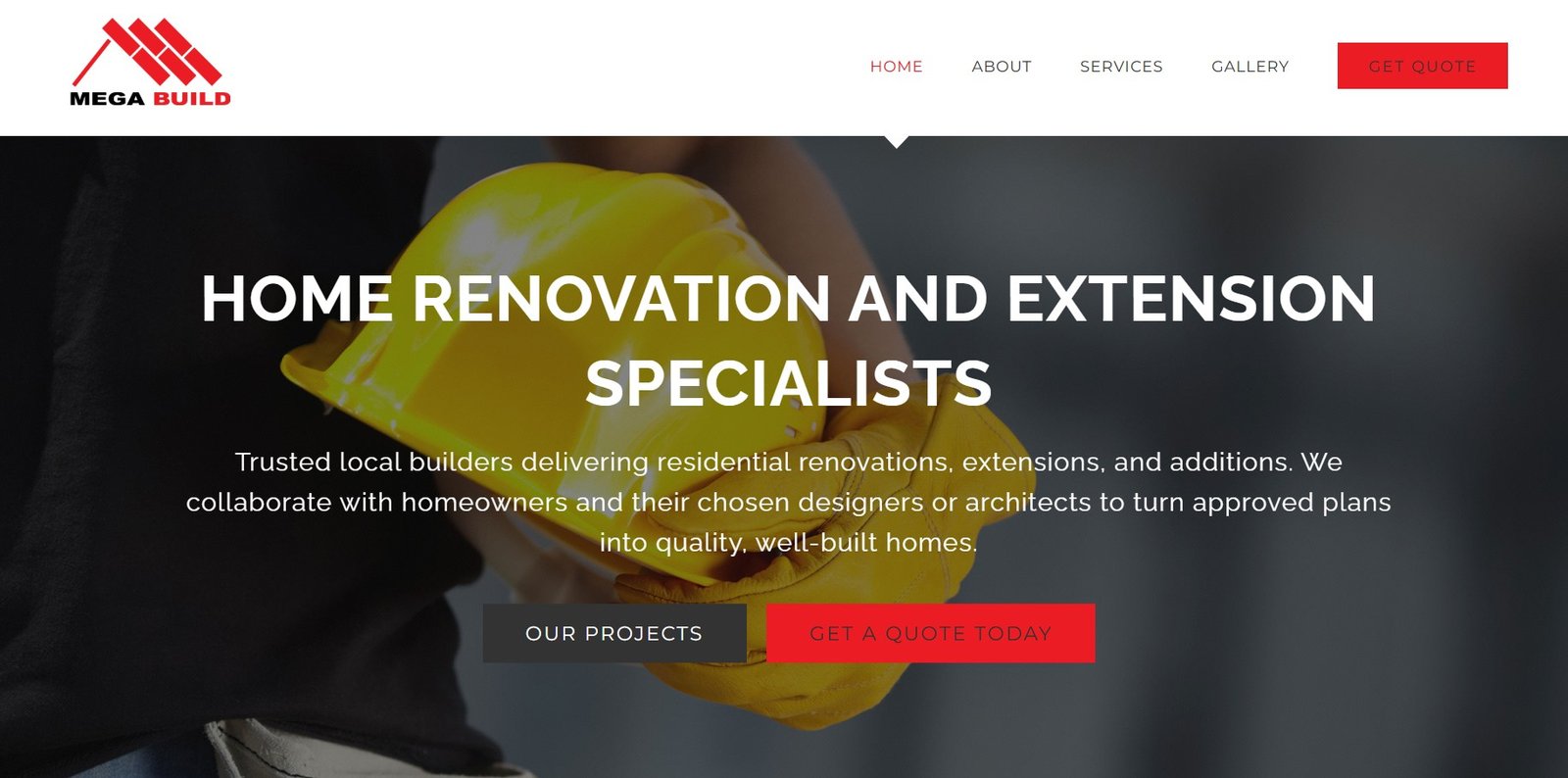
Although the original website had been created by an agency, it lacked many of the elements needed to attract visitors, establish trust, and convert potential customers into qualified leads.
The website’s key challenges included:
- A weak hero message that did not clearly communicate what the company offered
- Poor button readability, including black text on red backgrounds
- Weak and inconsistent calls to action
- A services section with little information and no links to individual service pages
- No dedicated pages targeting specific construction services
- An empty “View Our Work” section
- No featured projects on the homepage
- A gallery containing only images, with no project details or context
- No individual project case study pages
- A weak About Us section that did not tell the company’s story
- Contact forms placed on nearly every page, making the website feel repetitive and potentially spammy
- A basic contact page with no CAPTCHA or anti-spam protection
- Heavy reliance on stock images instead of authentic project photography
- Limited trust signals, such as licenses, memberships, reviews, and client testimonials
- Weak on-page SEO that prevented the company from ranking for its brand name
The Problem
Although the company provided quality construction and carpentry services, the website failed to communicate expertise and professionalism. The site consisted primarily of a homepage with limited service information. Visitors could not easily navigate to specific services, view completed projects, learn about the company, or understand why they should choose this contractor over competitors. Without a strong structure and conversion-focused design, valuable opportunities to generate inquiries and project requests were being lost.
Project Objectives
The primary objective was to redesign the website into a professional online platform that would:
- Clearly communicate the company’s construction services
- Build trust with potential clients
- Showcase completed projects and real workmanship
- Generate more calls, inquiries, and quote requests
- Provide a seamless experience on desktop, tablet, and mobile devices
- Create a consistent design based on the company’s logo and brand colors
- Improve the site’s visibility on Google
- Strengthen the company’s presence in AI-generated search results
The Process
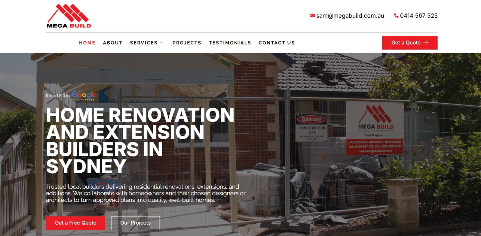
1. Created a Stronger Hero Section
The original hero section was replaced with a more compelling video hero featuring a clear headline, supporting message, and prominent call to action.
The new section immediately tells visitors:
- What the company does
- Who it serves
- Why potential clients should choose it
- What action visitors should take next
2. Improved the Website’s Visual Branding
The new website design was aligned with the company’s logo and established brand colors. Button colors, typography, backgrounds, and visual elements were updated to create a more consistent and professional appearance.
Accessibility and readability issues were also corrected, including the poor contrast caused by black text on red buttons.
3. Replaced Stock Images With Real Project Photos
Real construction and project images were added throughout the website to showcase the company’s actual work.
Authentic photography helps potential clients evaluate workmanship, understand the company’s capabilities, and feel more confident about requesting a quote.
4. Built Individual Service Pages
Instead of presenting every service on one weak, general page, dedicated pages were created for the company’s primary services.
Each service page now includes:
- A clear service overview
- Relevant benefits
- Details about the company’s approach
- Supporting project images
- Trust-building information
- A focused call to action
The homepage services section was also redesigned with clear descriptions and direct links to each relevant page.
This improved the customer journey while creating better opportunities to rank for specific service-related searches.
5. Developed Detailed Project Pages
The original gallery displayed images without explaining what each project involved. It was transformed into a structured project portfolio with individual project pages.
Each project page provides space for:
- The project name and location
- The type of construction work completed
- The project scope
- Materials or services provided
- Challenges and solutions
- A collection of relevant images
- A call to action for similar projects
This turned the company’s previous work into meaningful proof of its experience and capabilities
6. Strengthened the About Us Content
The About Us section was expanded to tell a more complete and credible company story.
Real team and client images were included to make the business feel more approachable and trustworthy. The revised content highlights the company’s experience, values, service approach, and commitment to quality construction.
7. Added Conversion and Trust Elements
Several conversion-focused sections were introduced across the website, including:
- Reasons to choose the company
- Real client testimonials
- A dedicated testimonials page
- Licenses, qualifications, and professional memberships
- Frequently asked questions
- A clear step-by-step work process
- Featured construction projects
- Detailed calls to action
- Quote and contact options
These additions answer common customer questions, reduce uncertainty, and give visitors more reasons to trust the business.
8. Improved the Contact Experience
It now includes:
- Clear contact information
- A more professional inquiry form
- Relevant fields for project details
- Business hours
- A CAPTCHA for spam protection
- A direct and specific call to action
9. Created a More Useful Footer
The original footer was replaced with a detailed, user-friendly footer containing:
- Quick links
- Links to individual services
- Contact information
- Business hours
- Important company information
- Clear navigation to key pages
This makes it easier for visitors to find important information from anywhere on the website.
10. Improved On-Page SEO
The website’s pages were optimized to help search engines better understand the company, its services, and its expertise.
The SEO work included:
- Improving page titles and meta descriptions
- Creating a clearer heading structure
- Optimizing service and project content
- Improving internal links
- Adding descriptive image alternative text
- Strengthening branded content
- Improving mobile responsiveness
- Organizing the website into a search-friendly page structure
Steps Taken
The complete website redesign included:
- Redesigning the website around conversions
- Improving the site’s mobile responsiveness
- Creating a stronger video hero section
- Adding authentic project and company images
- Creating individual service pages
- Building detailed project pages
- Improving the About Us content
- Adding client testimonials
- Displaying licenses and memberships
- Adding a “Why Choose Us” section
- Explaining the company’s process
- Creating an FAQ section
- Strengthening calls to action
- Improving the contact form and adding CAPTCHA
- Expanding the website footer
- Completing on-page SEO optimization
The Results
The redesigned website now provides a stronger and more professional representation of the construction company.
Instead of functioning as a simple online brochure, the site now works as a lead-generation platform that clearly presents the company’s services, showcases its completed projects, builds trust, and guides visitors toward requesting a quote.
The final website is:
- Responsive across desktop, tablet, and mobile devices
- Consistent with the company’s brand and logo colors
- Easier for potential customers to navigate
- More conversion-focused
- Supported by authentic images and real social proof
- Structured around dedicated services and project pages
- Better optimized for Google and AI-driven search experiences
Before the redesign, the website did not appear prominently when people searched for the company’s brand name. Following the redesign and SEO optimization, the business reached the number-one position on Google for its branded search and appeared in Google’s AI Overview.
All Case Studies
Get a Quote Today for Your new project!